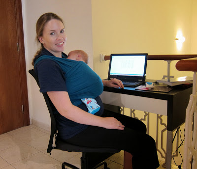
Sterling is my thesis ghostwriter. Or writing companion. Or something. This is what working on my thesis looks like these days.
I slept in those "clothes." I slept in that hair. That is yesterday's mascara under my eyes because all my personal hygiene routines have been carried out under duress since Sterling was born. BUT. I can type with both hands when Sterling is in the wrap, and that's what matters.
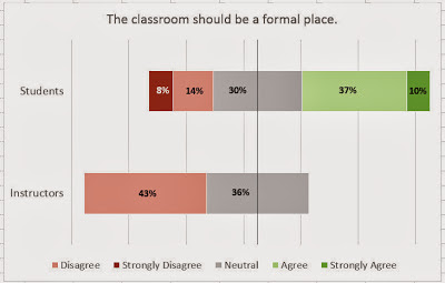
In other thesis news, I think I figured out how I want to display some of my data. I had my research participants indicate their agreement/disagreement on a Likert scale regarding some statements that are intended to get at the specifics of some cultural differences. For some of these statements, I want to show how the (Western, native speakers of English) instructors indicated different opinions than the (Muslim, Arab) students. I could have done a side-by-side double bar (or column) chart, but it just didn't show off the differences (or similarities) very well.
I did some googling and came up with a diverging stacked bar chart. Here are two samples I generated from my data to run by my supervisor. Because I need to know that he's on board with them before I invest the time to generate two dozen more.
Don't you think the above charts show the data off better than, say, this?
Once my supervisor gives the go-ahead (please oh please), then I'll fine tune the chart to just how I want it. There are a few...a lot...of quirks in Excel. Like how the legend switched the order of Disagree and Strongly Disagree. Not to mention the fact that it seems like there should just be a Diverging Stacked Bar Chart option in Excel to begin with. The internets are full of people begging to learn how to do these, and to make one you almost have to force Excel to create one against its will.
Hooray for beautiful charts that display data efficiently!


